
Review the whole path from the visitor's reason for arriving to the business's response. Relevant traffic, a clear offer, useful proof, a working enquiry route and timely follow-up all matter. Find the point where people lose clarity or encounter friction before choosing a redesign or a larger traffic budget.
Check why people are arriving
Start with the pages people enter and the campaigns or searches that bring them there. A visitor researching a broad question may have a different need from someone looking for a quote or reservation. Compare those groups before treating all visits as buying intent.
Check that each campaign leads to a page that answers its promise. If a post presents an offer, the destination should make that offer and the next action easy to find. Sending every visitor to the homepage can leave them with more searching to do.
Use your analytics and Search Console data as evidence, with their tracking limits understood. Avoid diagnosing the whole business from a small sample or a single unusually busy week.
Make the offer understandable
A new visitor should be able to identify what the business provides, who it serves and how to take the next step. Check the first screen and the relevant service page for those answers. Clear descriptions and specific proof help someone decide whether an enquiry is worthwhile.
Review the page with a person who has not seen the project brief. Ask them to explain the offer and find the next action. Their questions can reveal assumptions the internal team no longer notices.
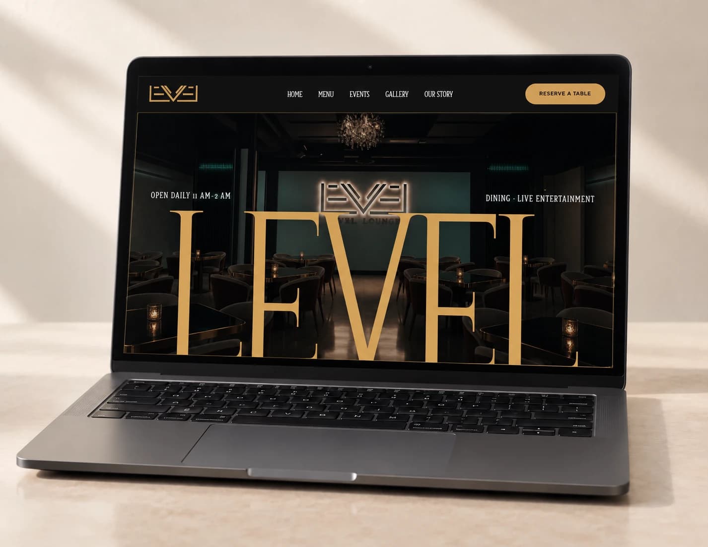
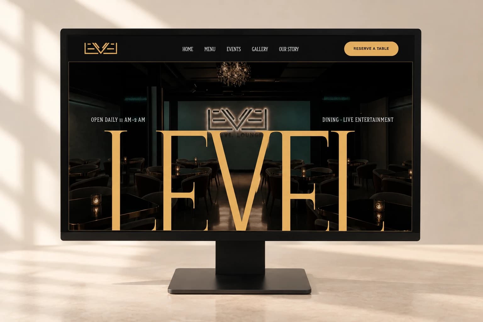
Level Lounge's homepage places a reservation action in its navigation and supports it with the venue's identity and experience. It is a useful example of making an action visible. We are not treating that design choice as a measured conversion result.
Test the enquiry path on a phone
Open the page on an actual phone and complete the action. Check navigation, readable type, tap targets, form labels and any embedded booking system. A page that looks good in a desktop design file can still be difficult to use in a customer's context.
For a form, ask only for information needed to handle the request at this stage. Explain what happens after submission. Check errors, required fields and the success message, then verify that the request reaches the right person.
For booking or click-to-call, follow the link and confirm the destination. A visible button only helps when it leads to an available and understandable next step.
Look at each stage separately
Use this diagnostic table to choose what to investigate. The observations are starting points, not proof of a cause.
| Observation | What to investigate | A useful check |
|---|---|---|
| Visitors leave before reaching the offer | Traffic relevance and first-screen clarity | Compare entry pages and campaign promises |
| People read but do not start an enquiry | Offer, proof and visibility of the next step | Ask a new reader to explain the service and find the action |
| People start a form but do not finish | Fields, errors, mobile usability and trust | Complete the form on a phone and test failures |
| Submissions appear but the team receives little | Tracking definitions and delivery | Trace a test submission into the actual inbox or system |
| Enquiries arrive but rarely become conversations | Fit, response process and qualification | Review recent enquiries with the person handling them |
Check speed and technical basics
Slow media, layout shifts and broken controls can interrupt a visitor trying to act. Run a technical check, then investigate the specific issue on important pages. A performance score is useful context, but it does not explain every missed enquiry.
Check that search engines can discover the pages people need and that the content is readable and accurate. Google's Search Essentials is a useful primary reference for these foundations. Your service pages and important internal links should remain clear as the site changes.
The WebRise SEO audit tool can provide an initial technical review. Pair its findings with a real journey test, delivery checks and the business's enquiry records.
Fix one bottleneck and measure again
Choose a change that addresses the evidence: clarify an offer, correct a destination, simplify a form or repair delivery. Record what changed and compare a meaningful period with the starting point. Keep traffic sources and other business changes in view.
If several parts of the journey are unclear, a broader website scope may be appropriate. The brief should still name the problem and the actions it needs to support. That gives the redesign a purpose and the business a way to assess it.
Common questions
Will more traffic solve a low enquiry rate?
First check whether the existing visitors are relevant and can complete the enquiry path. More traffic can increase activity, but an unclear offer or broken form needs its own fix.
What is a good website conversion rate?
Define the action first, then compare relevant traffic and qualified outcomes in your own context. A booking, a submitted form and a qualified sales conversation are different measures, so a universal benchmark can mislead.
How do I know whether my form works?
Test the complete path: valid submission, error handling, success feedback and delivery into the inbox or system used by the business. Repeat on a phone and confirm that the team can respond.
Put it into practice
Sources and project examples
- Google Search EssentialsPrimary guidance on the technical and content foundations for Search.
- Level Lounge websiteAn actual example of visible reservation navigation, without a claimed conversion uplift.
- WebRise website servicesWebsite strategy and implementation scope.
Practical notes from WebRise's strategy, website and production work.