WebRise Brand Assets
Official logos, color palette, and typography guidelines. Use these assets to represent WebRise consistently.
Naming & Usage
Naming
"WebRise" is always written as a single word with a capital "W" and capital "R". This is the official brand name for our company and all subsidiaries. Never use variations like "Web Rise", "webrise", "web rise", or "Webrise". The brand should always appear as "WebRise" in all communications and materials.
Usage
Provide plenty of space around WebRise assets. Make them big or make them small, but give them room to breathe. They shouldn’t feel cramped or cluttered.
The provided graphics are proprietary and protected under intellectual property laws. Do not alter these files in any way, display these graphics in a way that implies a relationship, affiliation, or endorsement by WebRise of your product, service, or business. Do not use these graphics as part of your own product, business, or service’s name, or combine these graphics with any other graphics without written consent from WebRise. Get in touch if you have questions.
Logos
Featured — Curved Wordmark (Preferred)
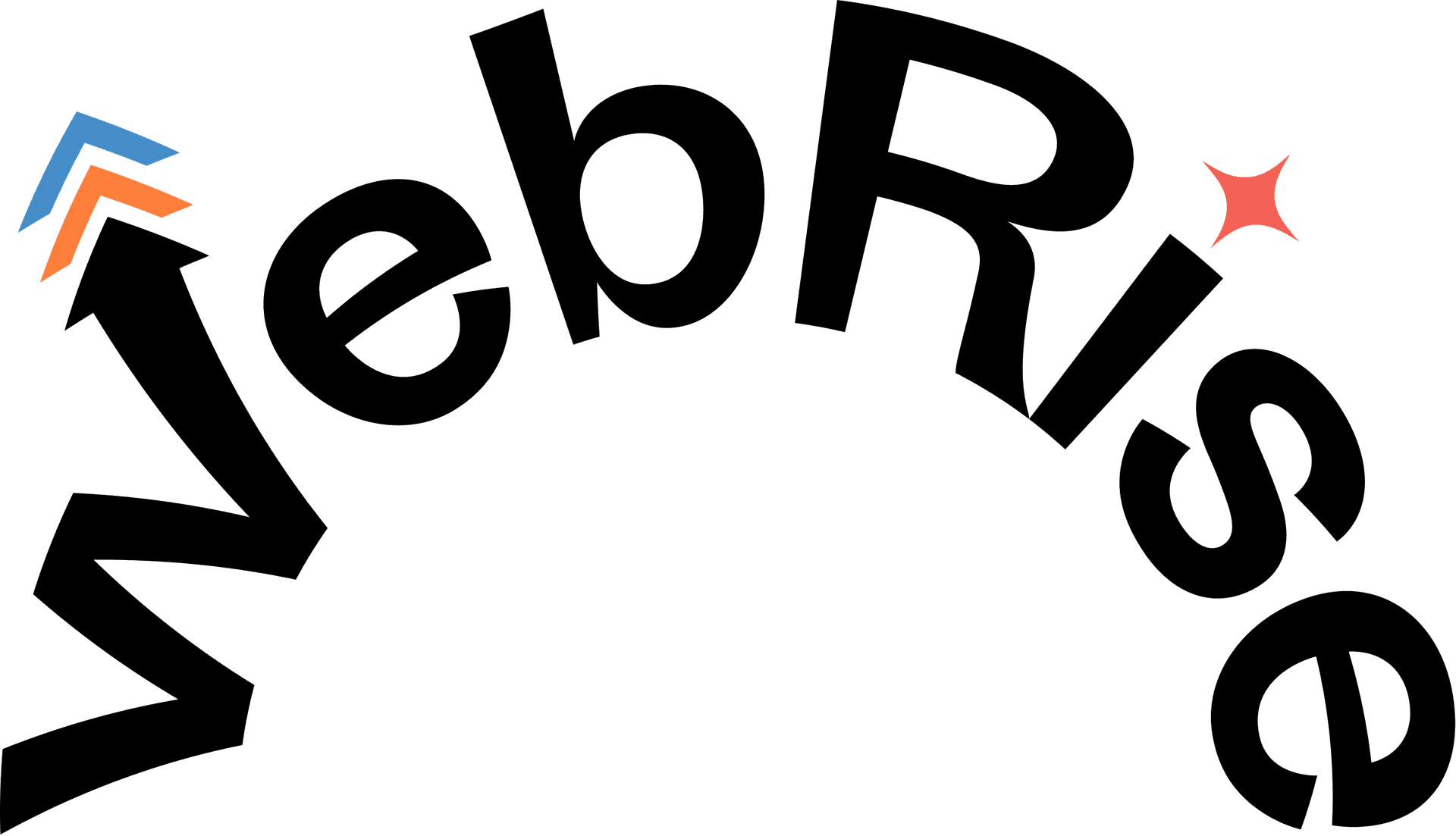
Primary wordmark for light backgrounds
Primary wordmark for dark backgrounds
Alternative Wordmark — Flat
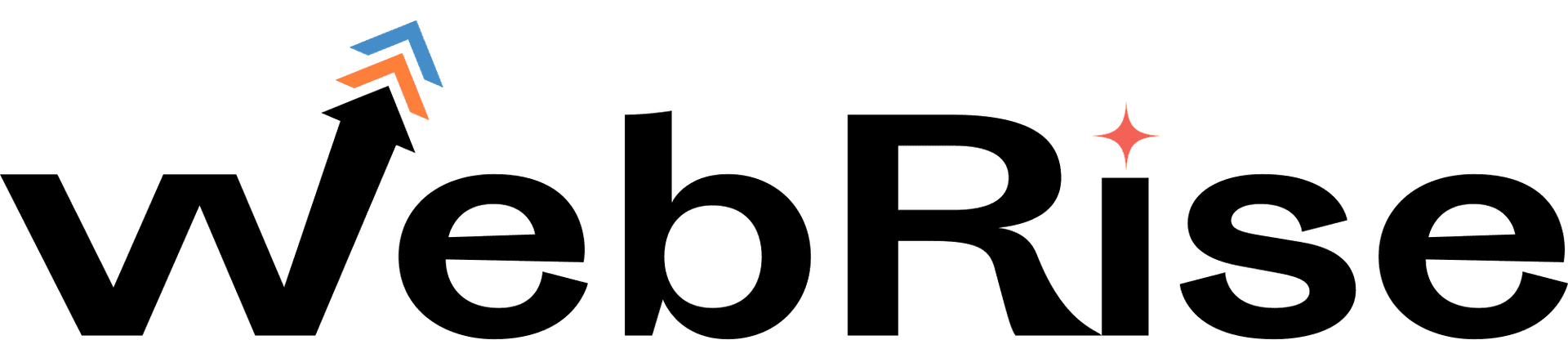
Flat wordmark for light backgrounds

Flat wordmark for dark backgrounds
Icon — W mark (Tight spaces)
For light backgrounds and compact placements
For dark backgrounds and compact placements
Color Palette
Typography
ABCDEFGHIJKLMNOPQRSTUVWXYZ abcdefghijklmnopqrstuvwxyz 0123456789